

The Challenge: Despite a loyal local following, Mithaicana had no digital footprint. All orders, including large corporate and bulk purchases, had to be placed in-person, severely limiting their market reach, brand visibility, and sales potential in an increasingly digital world.
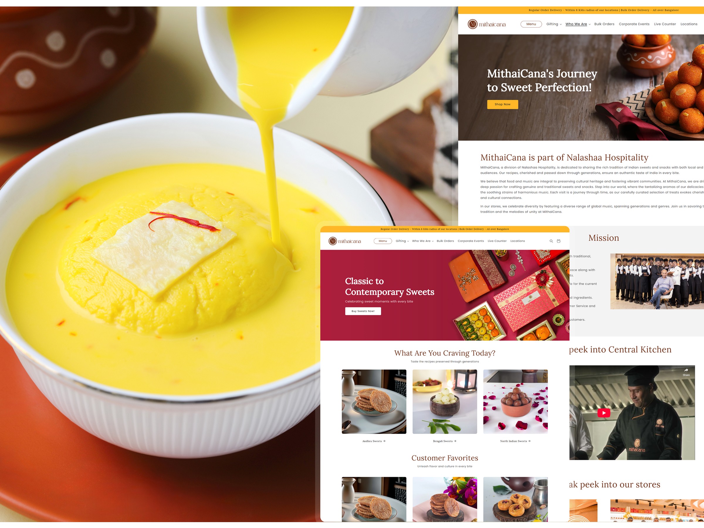
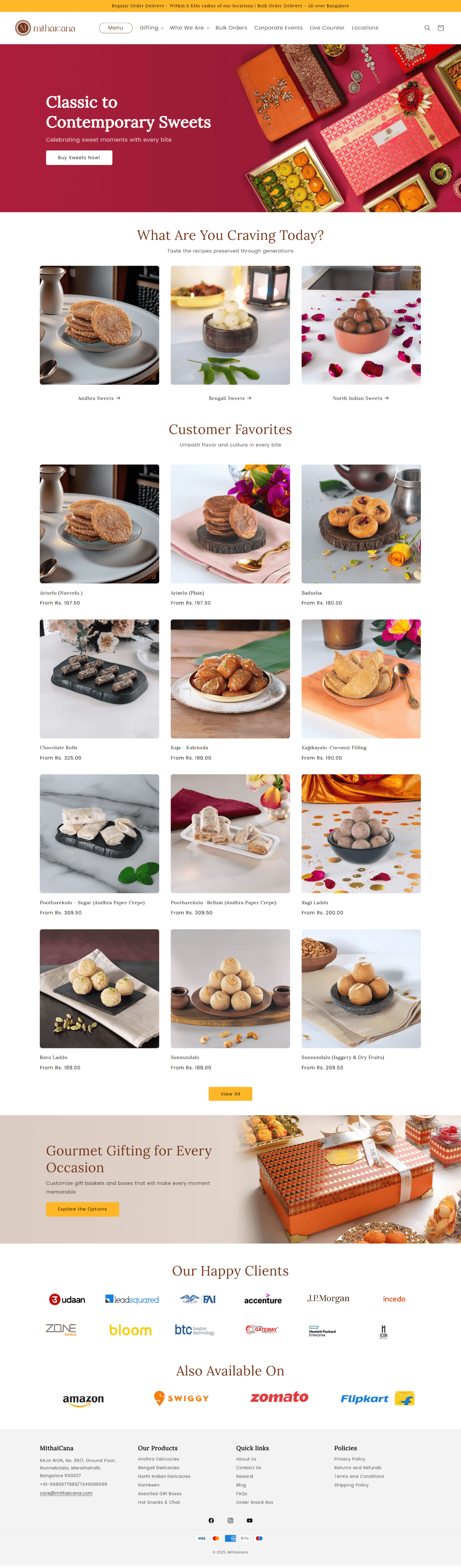
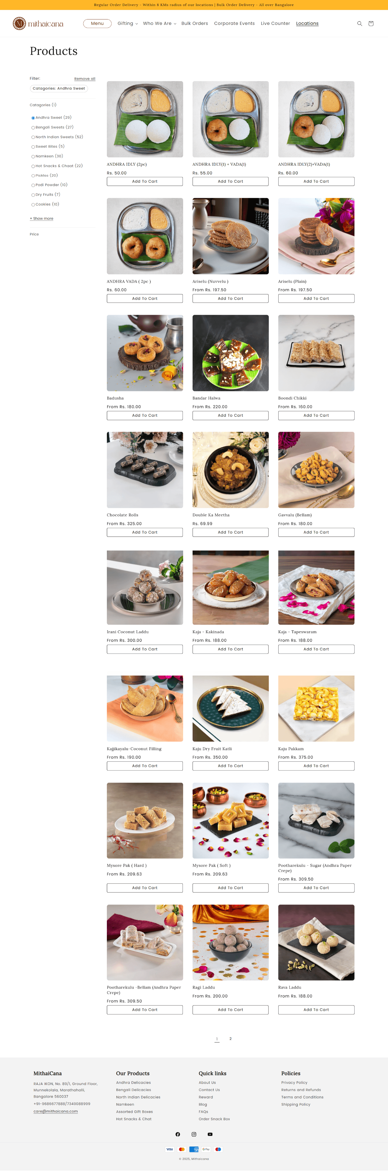
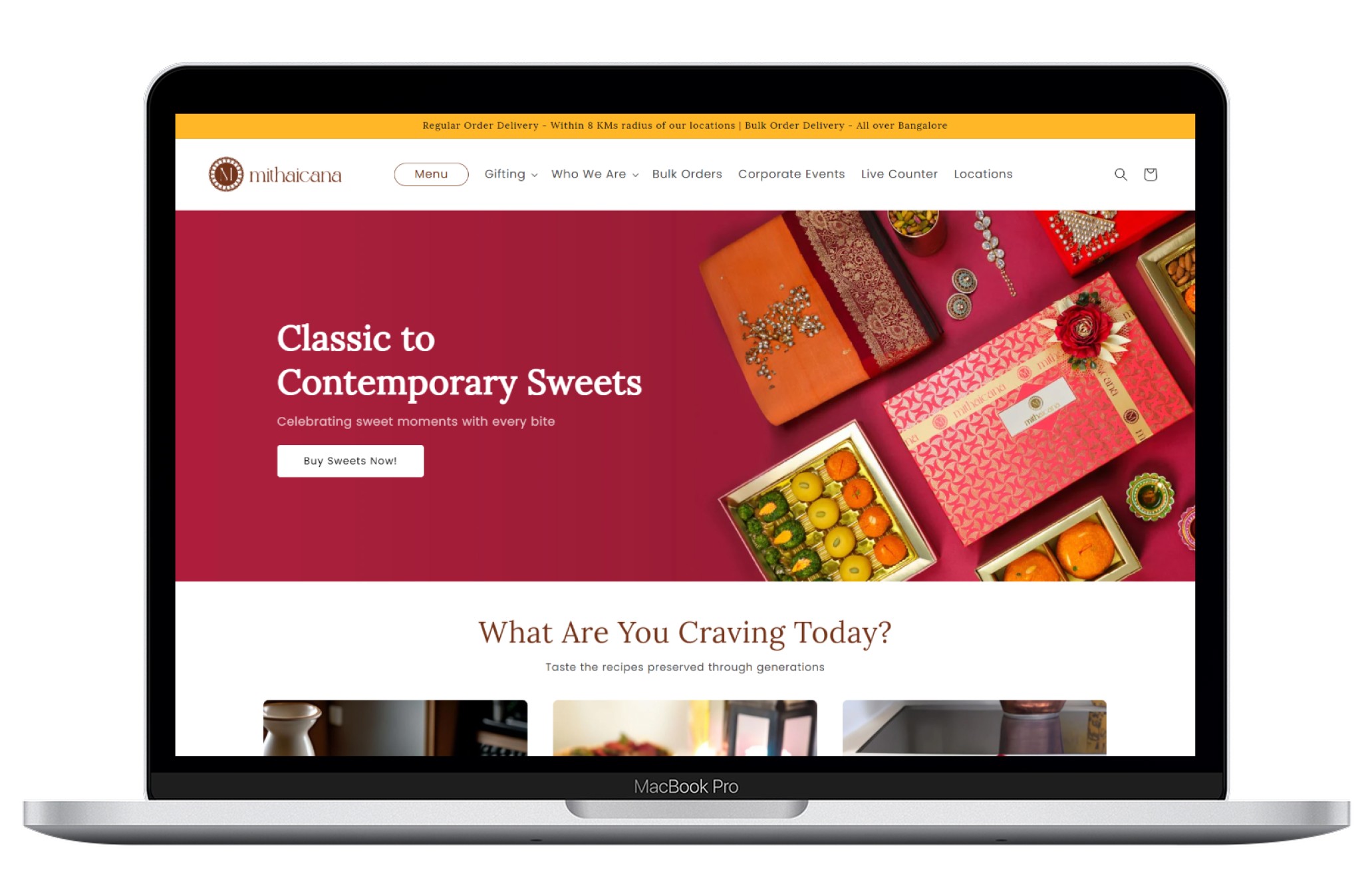
The Solution: I led the design of a responsive e-commerce website, moving from initial concept to a live, revenue-generating platform in an intensive 5-day sprint. The website serves as a digital storefront, a brand storytelling platform, and a direct sales channel for retail and corporate clients.
My Role: As the lead designer in a two-person team, I was responsible for the end-to-end UX/UI process, including stakeholder interviews, competitive analysis, wireframing, and overseeing the final design implementation.
Key Outcome: The new website successfully generated 18-22% of Mithaicana's total monthly sales within its initial launch phase.
Mithaicana's core business problem was a complete lack of an online presence. This created several critical challenges:
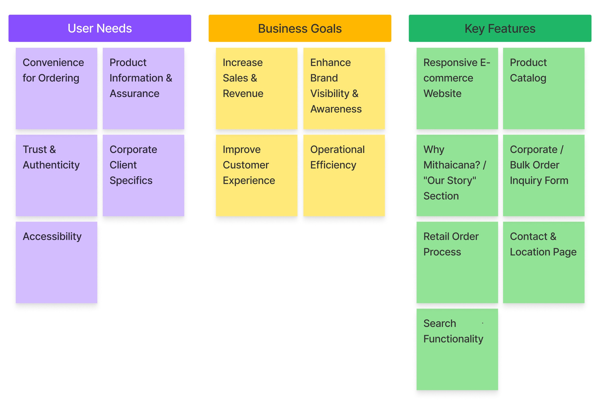
Inconvenient Ordering: Customers (daily users, corporate clients, bulk purchasers) had no way to view the product catalog or place orders remotely, leading to friction and potential lost sales.
Limited Brand Awareness: The brand's story, its commitment to quality, and the aesthetic of its products were unknown to a wider audience, especially in the lucrative corporate gifting sector.
Stagnant Growth: Without a digital sales channel, the brand's growth was capped by the physical capacity of its single store.
The primary goal was clear: To design and launch a digital platform that would increase sales, build brand awareness, and effectively translate the rich, traditional experience of Mithaicana into a modern, user-friendly website.
Given the aggressive 5-day timeline, I adopted a Lean UX methodology, focusing on rapid iteration, constant collaboration, and prioritizing core functionalities.
My first step was to gather as much information as possible to ensure we were building the right product.
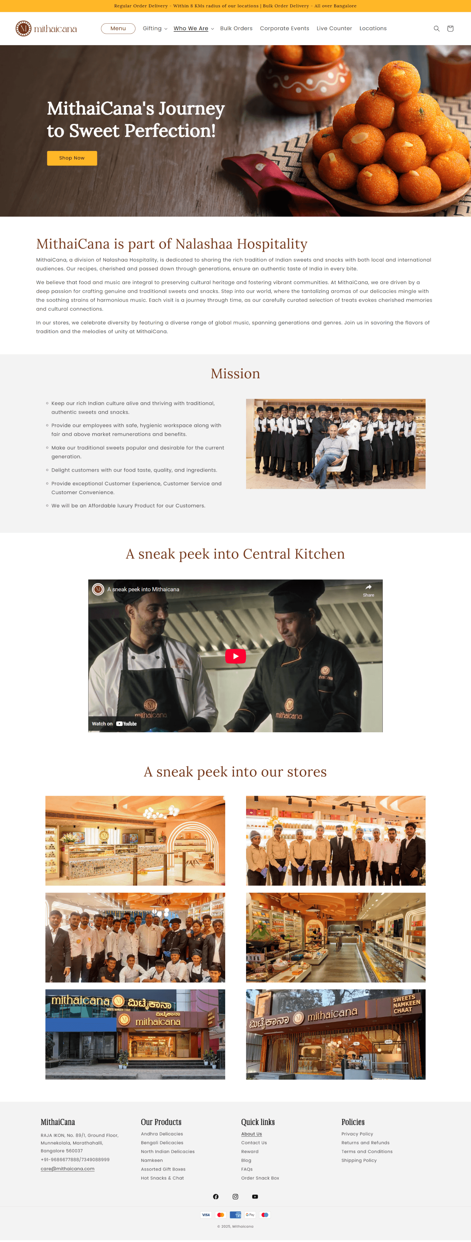
Stakeholder Interviews: I sat down with the Mithaicana leadership to understand their vision. Key takeaways were the need to project an image of quality and authenticity, showcase their modern kitchens, and tell their brand story, all while driving sales.
Competitive Analysis: I analyzed the websites of 3-4 key competitors. I looked for common patterns in their user flow (especially for bulk orders), product presentation, and checkout processes. This helped us identify "table stakes" features and opportunities to differentiate.
Sales Team Intel: I interviewed the sales and business development team to understand the corporate client's mindset. They revealed that corporate clients are primarily concerned with:
Product Appearance: High-quality imagery is non-negotiable.
Kitchen & Fulfillment Capacity: They need assurance of quality control and the ability to handle large orders.
Pricing & Authenticity: Clear pricing and a sense of the brand's heritage are crucial.
A review of key competitors shows a clear market opportunity:
Anand Sweets: The Professional Leader. Their polished website and strong brand make them the top competitor, but they can feel corporate.
India Sweet House: The Artisanal Storyteller. They compete effectively with a unique "organic" narrative, not just products.
Estaa Sweets: It has a bit dated or unpolished website with poor corporate ordering, making them easy to outperform online.
The Opportunity: Mithaicana can succeed by combining the professionalism of Anand Sweets with the unique storytelling of India Sweet House to create a superior and more personal user experience, especially for corporate clients.

Priya is a busy and ambitious professional responsible for all aspects of Human Resources at a growing tech company. She is responsible for organizing office events, celebrations, and client meetings. She frequently orders sweets in bulk for festivals, birthdays, and corporate gifting.
35
MBA
Bengaluru, India
Senior HR Manager
To find a high-quality, premium sweet vendor for a bulk order of 200+ gift boxes.
To efficiently browse products, view packaging options, and understand pricing without leaving her office.
To get a formal quotation and finalize the logistics (delivery, customization) smoothly and quickly.
To impress her colleagues and company leadership with her choice of vendor.
Lack of Visibility: Cannot see the product quality or packaging options from traditional vendors without physically visiting their stores.
Time Consuming: Wasting valuable work hours travelling to multiple vendors across the city to compare options.
Uncertainty & Risk: Has no way to verify the quality, authenticity, or hygiene standards of a vendor's kitchen.
Inefficient Process: The process of getting a simple quote involves multiple phone calls, follow-ups, and lacks a professional paper trail.
Limited Information: Finds it hard to gauge if a vendor can truly handle the scale and logistics of a large corporate order.
I'm planning our company's Diwali gifting for 200 employees. I need to find a vendor that is premium, reliable, and professional, without spending a week visiting shops all over the city.
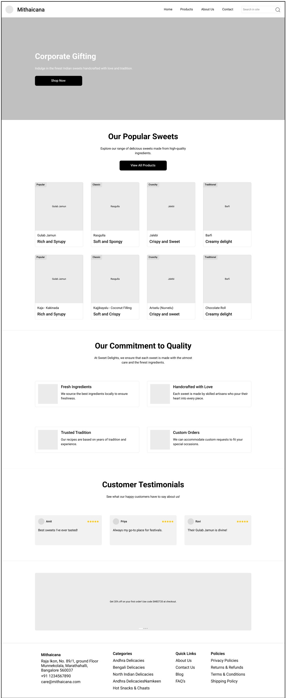
Based on these requirements, I designed the initial low-fidelity wireframes, focusing on a clean structure and logical user flow. These were then reviewed and approved by my design manager and the stakeholders.


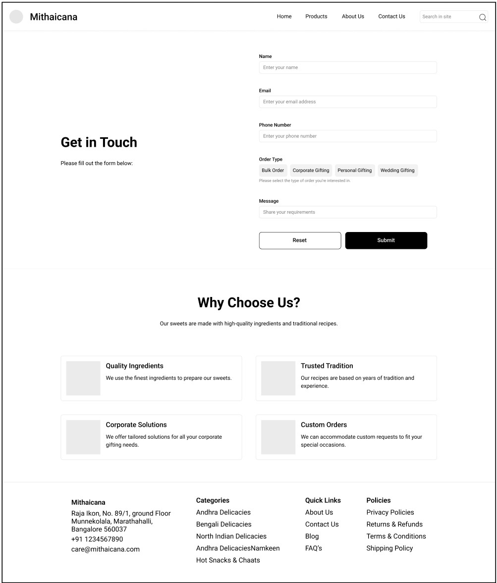
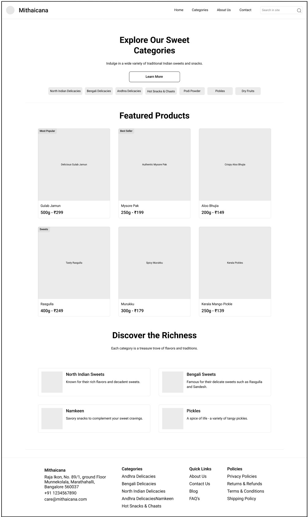
The handoff process was unique. My design partner was also the sole developer. This, combined with the 5-day deadline, meant we had to be incredibly agile and make pragmatic compromises. The approved wireframes served as a strong guide, but some elements had to be simplified for rapid development.
Our focus shifted from pixel-perfection to launching a functional, valuable product. We had to prioritize. We collaborated constantly, ensuring the core purpose of each page was retained even if the final execution differed slightly from my initial wireframe.

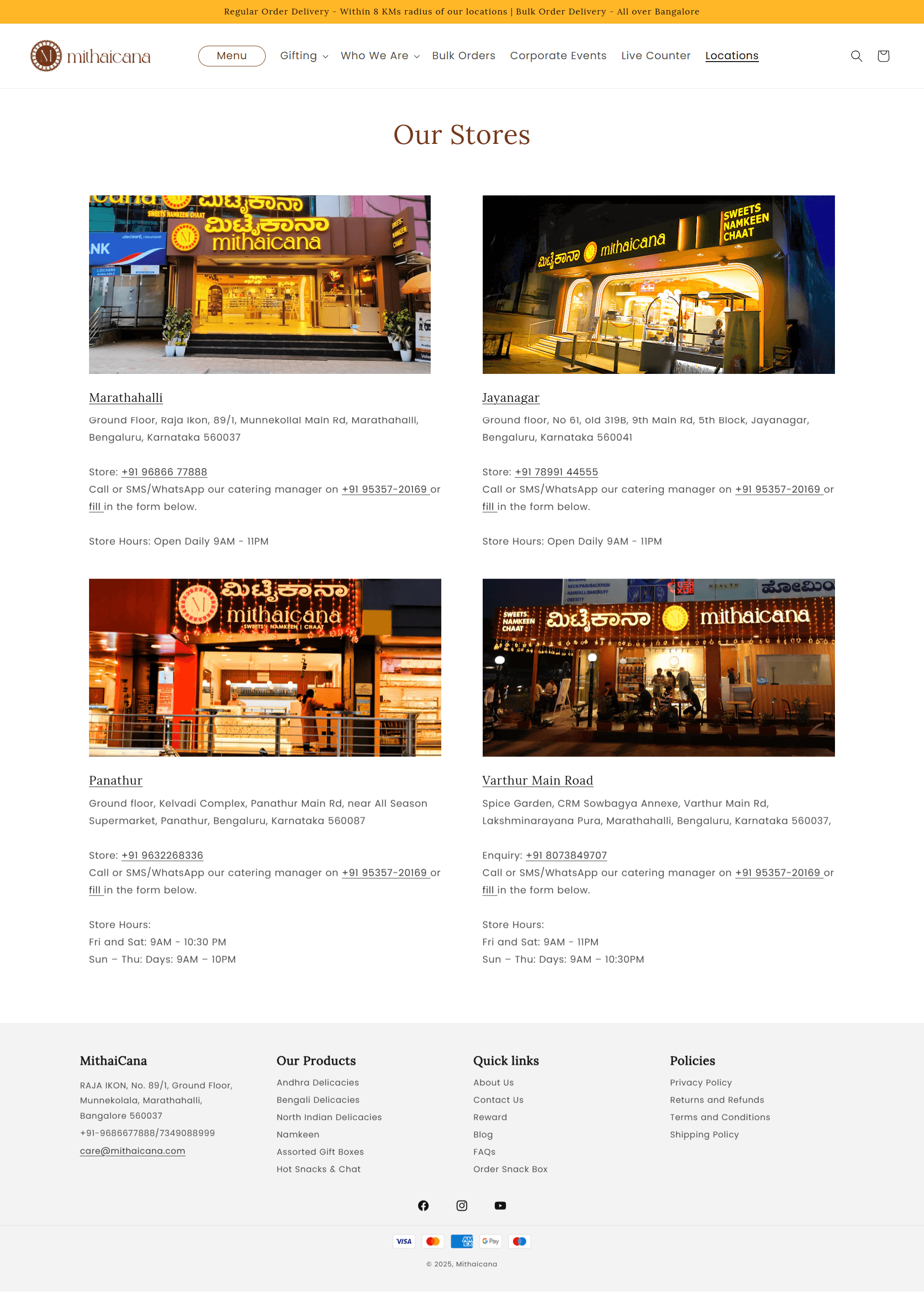
Interactive map strip did not made it to the final website.
Reason:
Avoiding redundancy - Since the Contact Us page already features a full-site map for general enquiries, we opted to keep the Locations page leaner and focused on individual store details rather than repeat the same map.
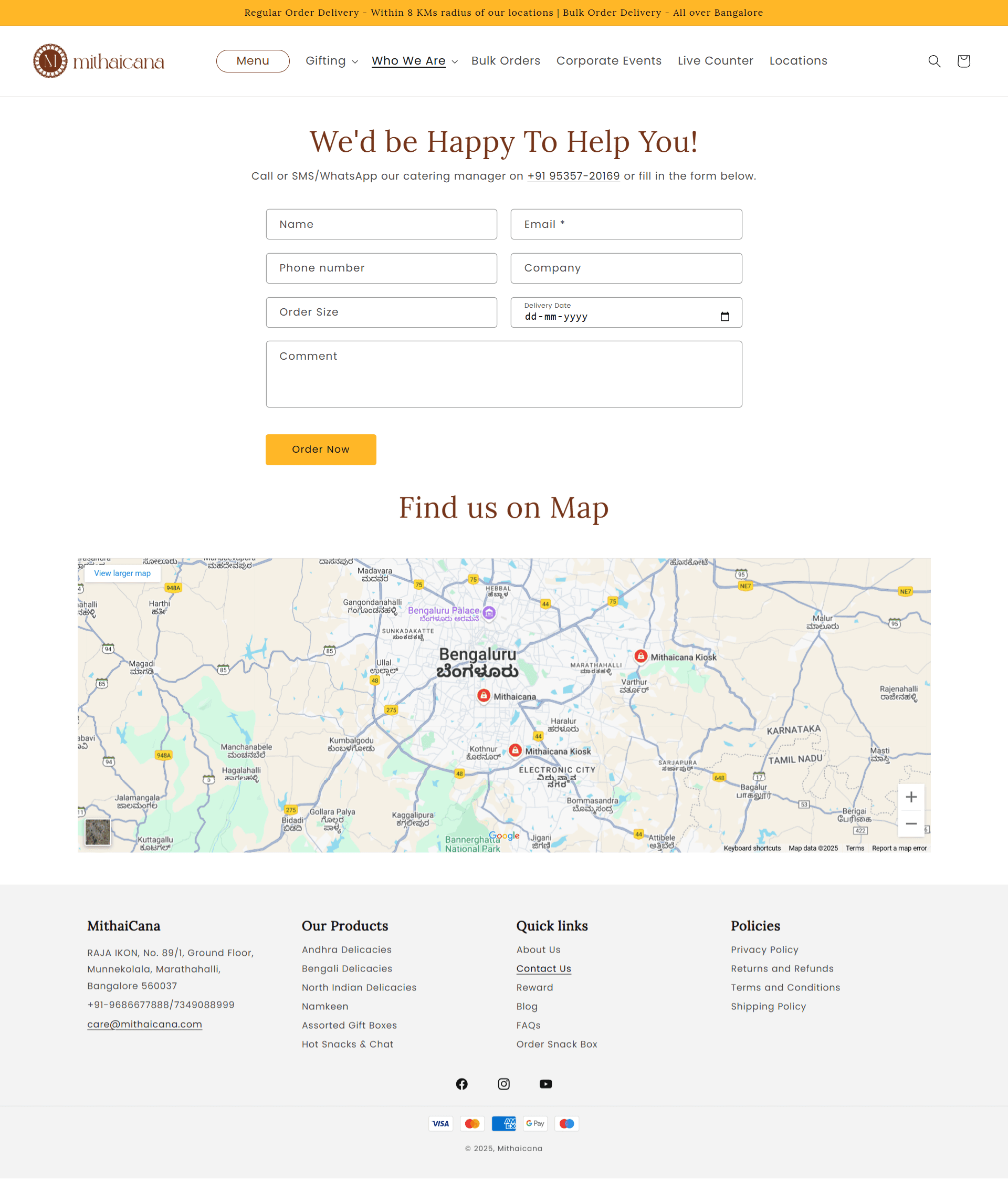
1. The “Why Choose Us?” feature-card block from wireframe never made it into the live Contact Us page.
Reason:
Map prominence - The stakeholder insisted the map be front-and-center on Contact Us, so we removed the “Why Choose Us?” cards to keep it simple.
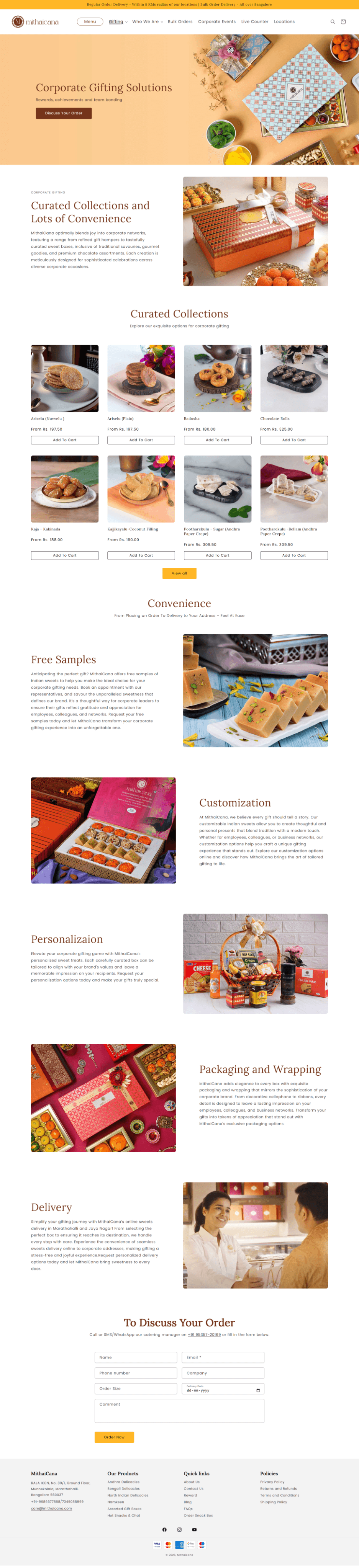
The final product is a clean, elegant, and user-centric website that directly addresses the initial goals. It effectively showcases Mithaicana’s products through professional photography and provides clear pathways for both individual and corporate customers to place orders, driving the business forward into the digital space.
The launch was an immediate success. By creating a much-needed digital channel and promoting it, we were able to directly influence the company's bottom line.
18-22% of Monthly Sales: The website is now responsible for a significant portion of the company's revenue, sourced directly from leads generated online.
New Revenue Stream: We successfully opened up the corporate and bulk order market, which was previously untapped online.
Enhanced Brand Equity: The website now serves as the primary touchpoint for new customers, establishing Mithaicana as a professional and trustworthy brand.
This project was a masterclass in rapid execution and pragmatic design.
Perfection is the Enemy of Good (and Done): On a tight deadline, it's more important to launch a functional product that solves the core problem than to chase pixel-perfection. I learned to distinguish between "essential" and "nice-to-have."
The Power of Collaboration: The close-knit collaboration between design and development (even in one person) was key. Constant communication prevented major roadblocks and allowed us to adapt quickly.
An MVP is a Starting Point: The launched website is not the end but the beginning. It's a foundation upon which to build.
Based on the initial success, I would recommend:
Full E-commerce Integration: Develop a full-fledged online payment and order tracking system for corporate clients.
User Feedback & Iteration: Conduct user testing on the live site to identify pain points and gather data for future design improvements.
Content Expansion: Build out a blog or "Our Story" section with more content about the art of Indian sweet-making to further enhance brand authenticity.

“Design is not just what it looks like and feels like. Design is how it works.”
- Steve Jobs